FOLIO
Overview
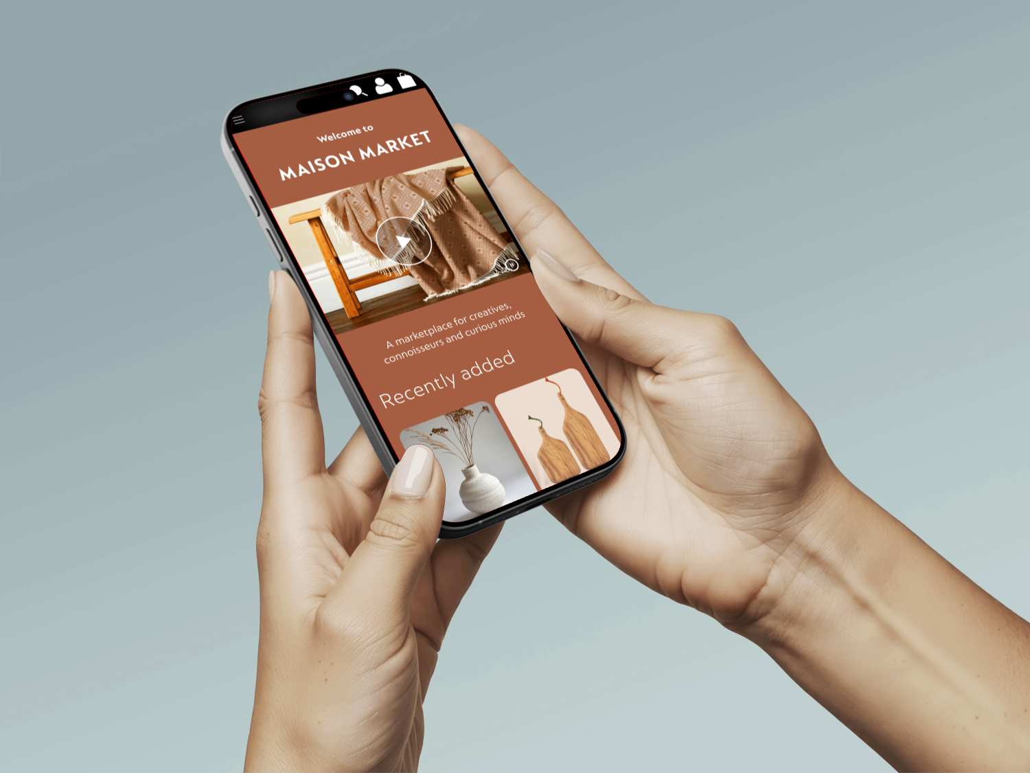
The client approached us to evaluate the overall user understanding of their mobile website concept and to validate several feature-related assumptions.
We collaborated with the client to identify and map out their key assumptions, ensuring alignment on the aspects to be tested. Our focus was exclusively on the mobile version of their website (excluding the app).
Role & Responsibilities
Lead UI/UX Designer responsible for interface design and usability testing.
Process
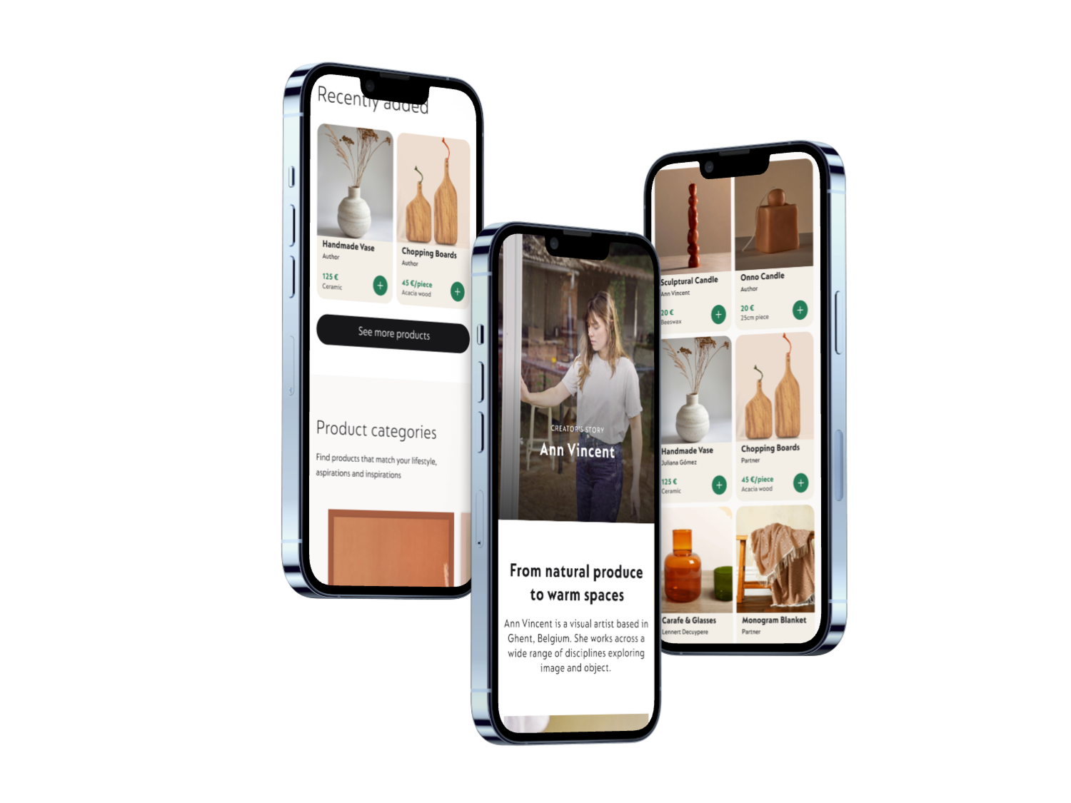
Using the Design System provided by the client, I designed the prototype in Figma and with my team we ran the test using Userberry.
We first selected 10 features of the mobile site to be tested with consumers and planned a prototype across a complete user journey, from access to order confirmation.
Once we nailed the flow, we moved to the qual and quant validation process. Running interviews and quant tests with multiple users — some regular customers of the brand and some new to it.
The results
After testing assumptions, we categorised results based on customer happiness and how well they help conversions. We split things into three groups: essential, good to have, and low priority.
Essential: Single-page checkout (for most), ratings (for some) and maker's stories are driving customer satisfaction
Good to have: Backlinking, self-explanatory categories, explaining the why, and menus and search bars are baseline expectations
Low priority: Loyalty programs, prompts to login and sending 1+ emails are considered friction
