PORT
PORTFOLIO
PORTOverview
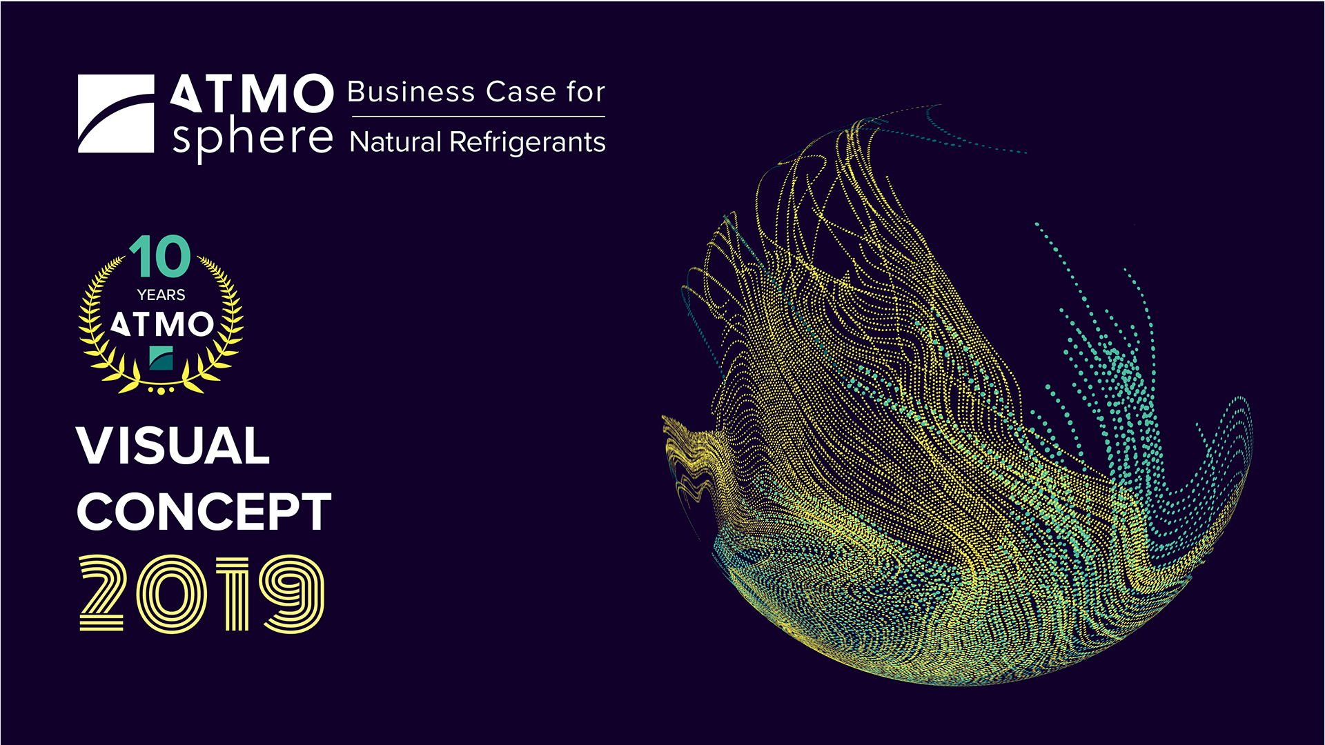
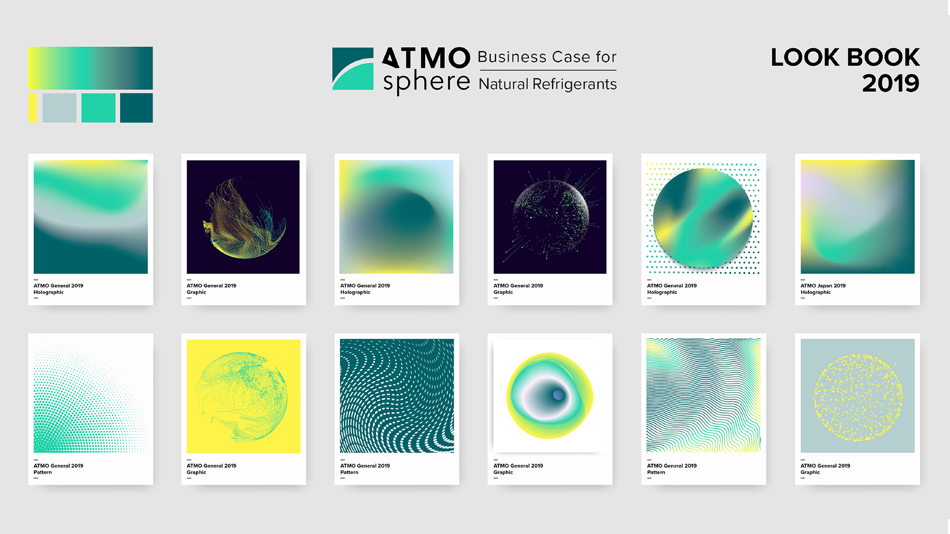
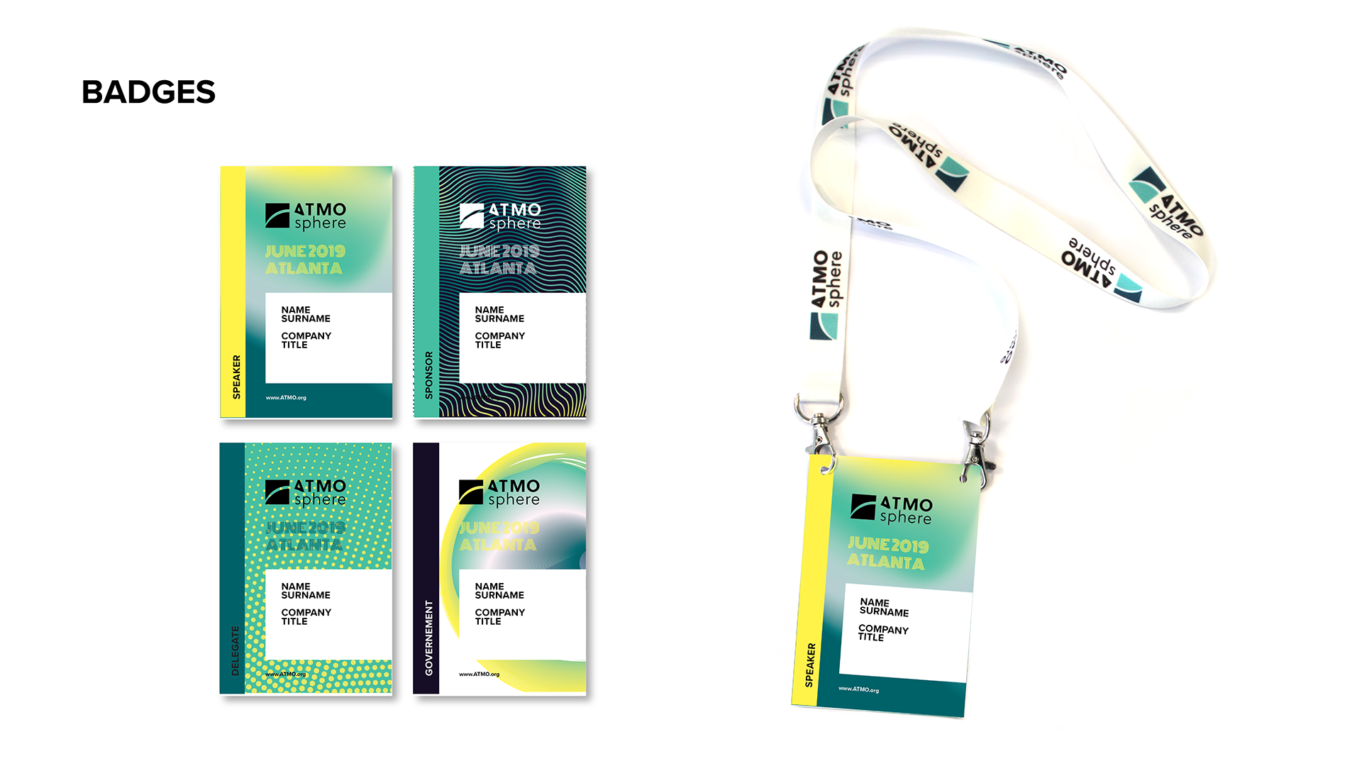
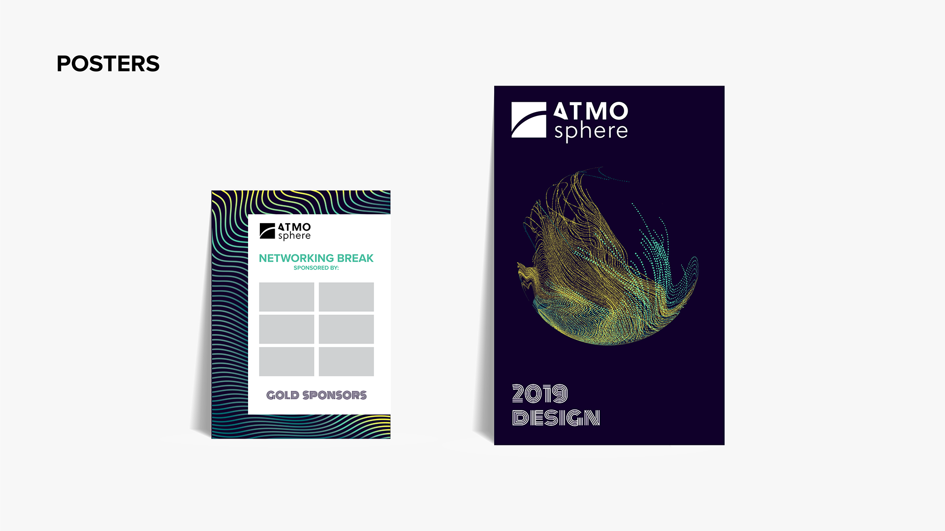
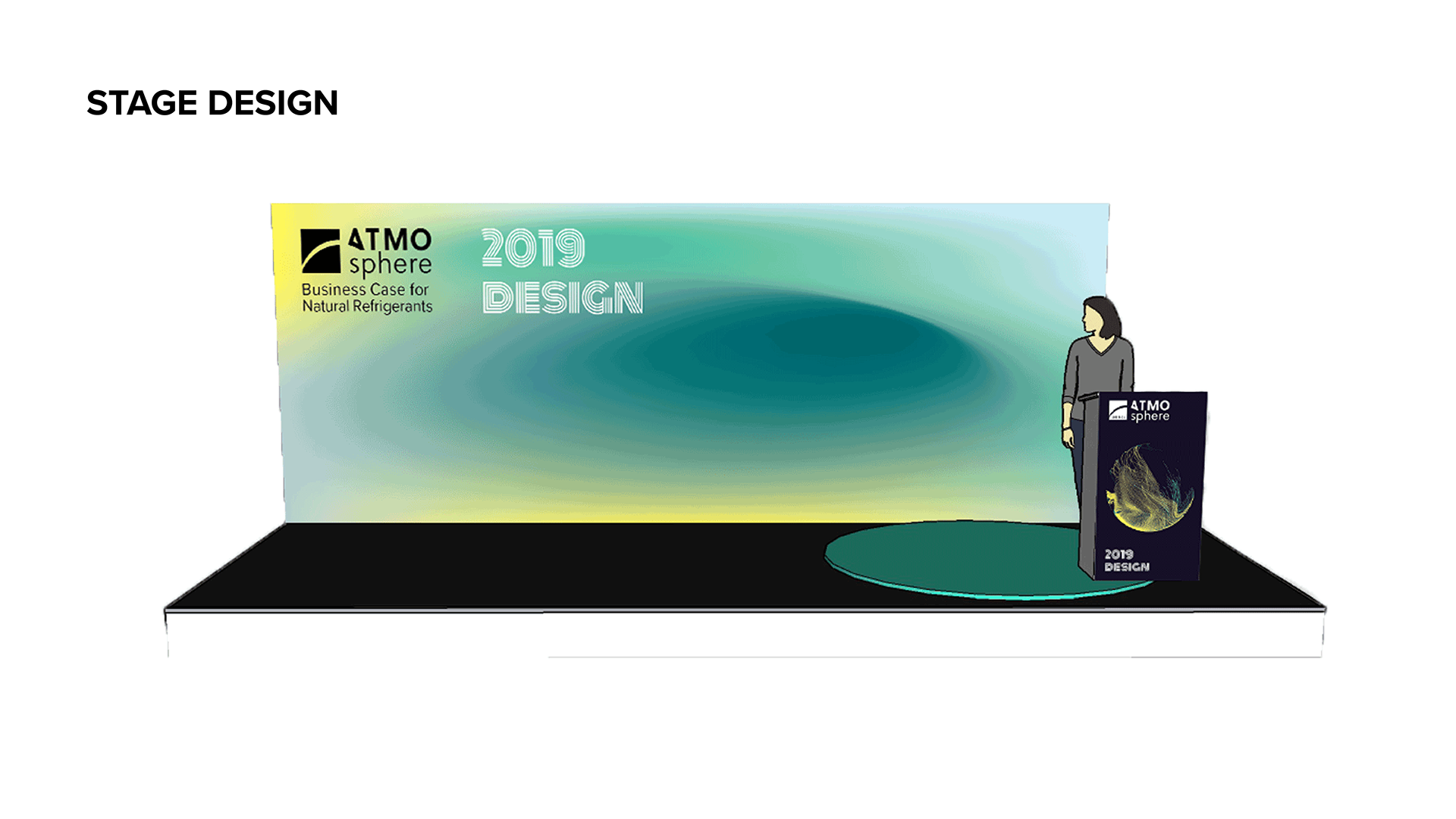
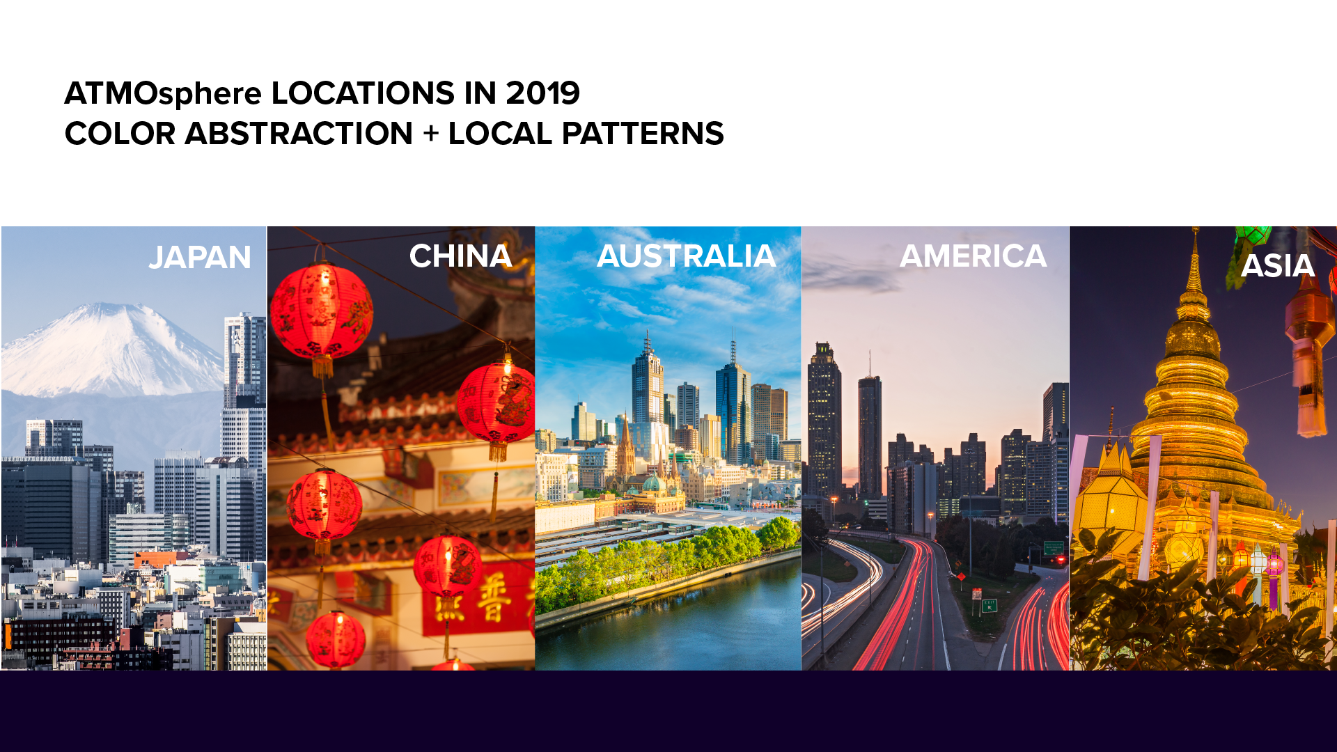
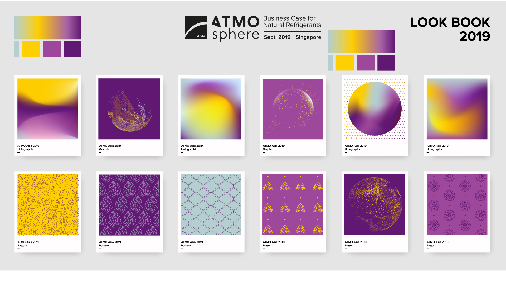
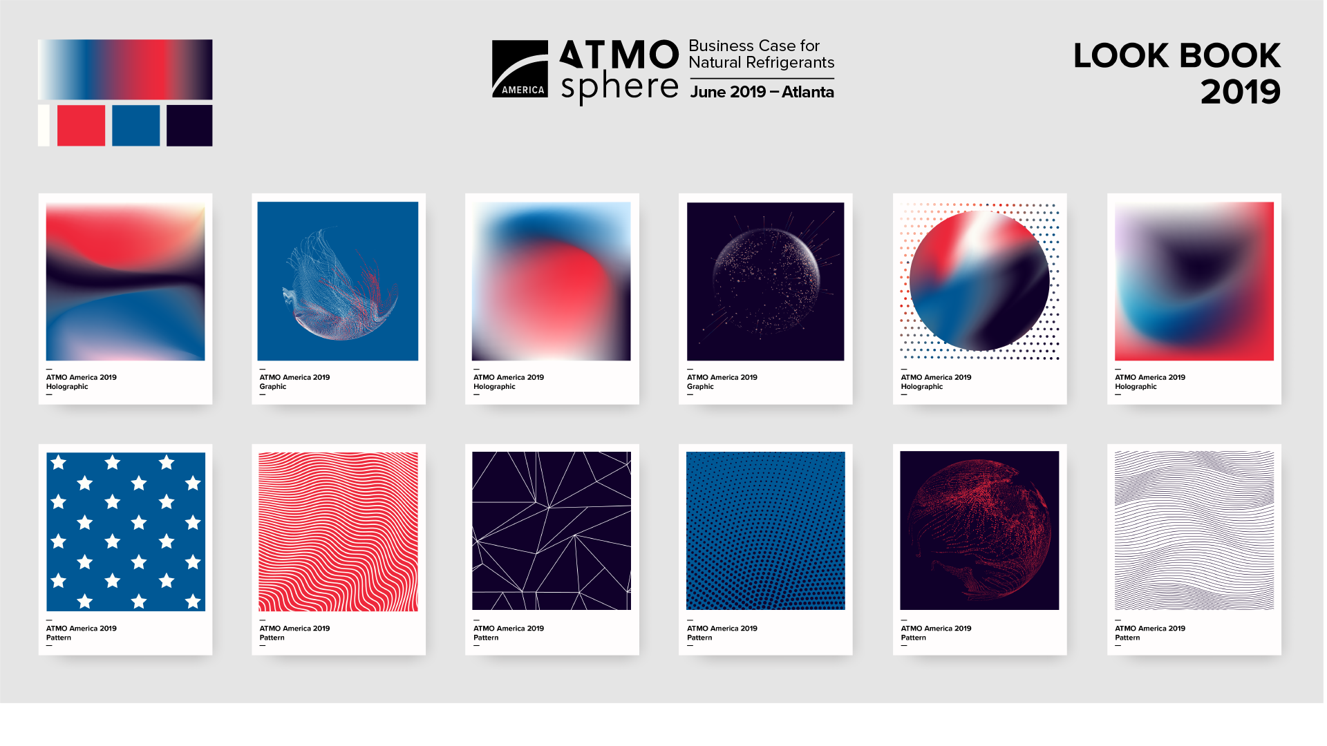
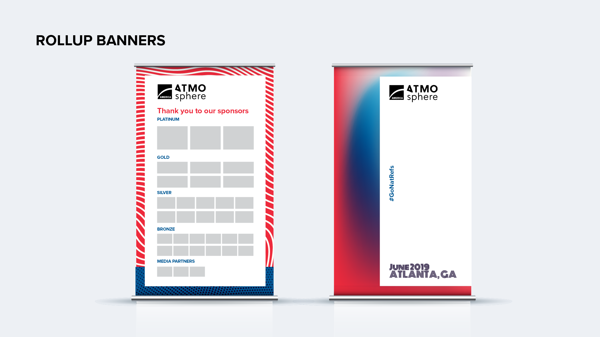
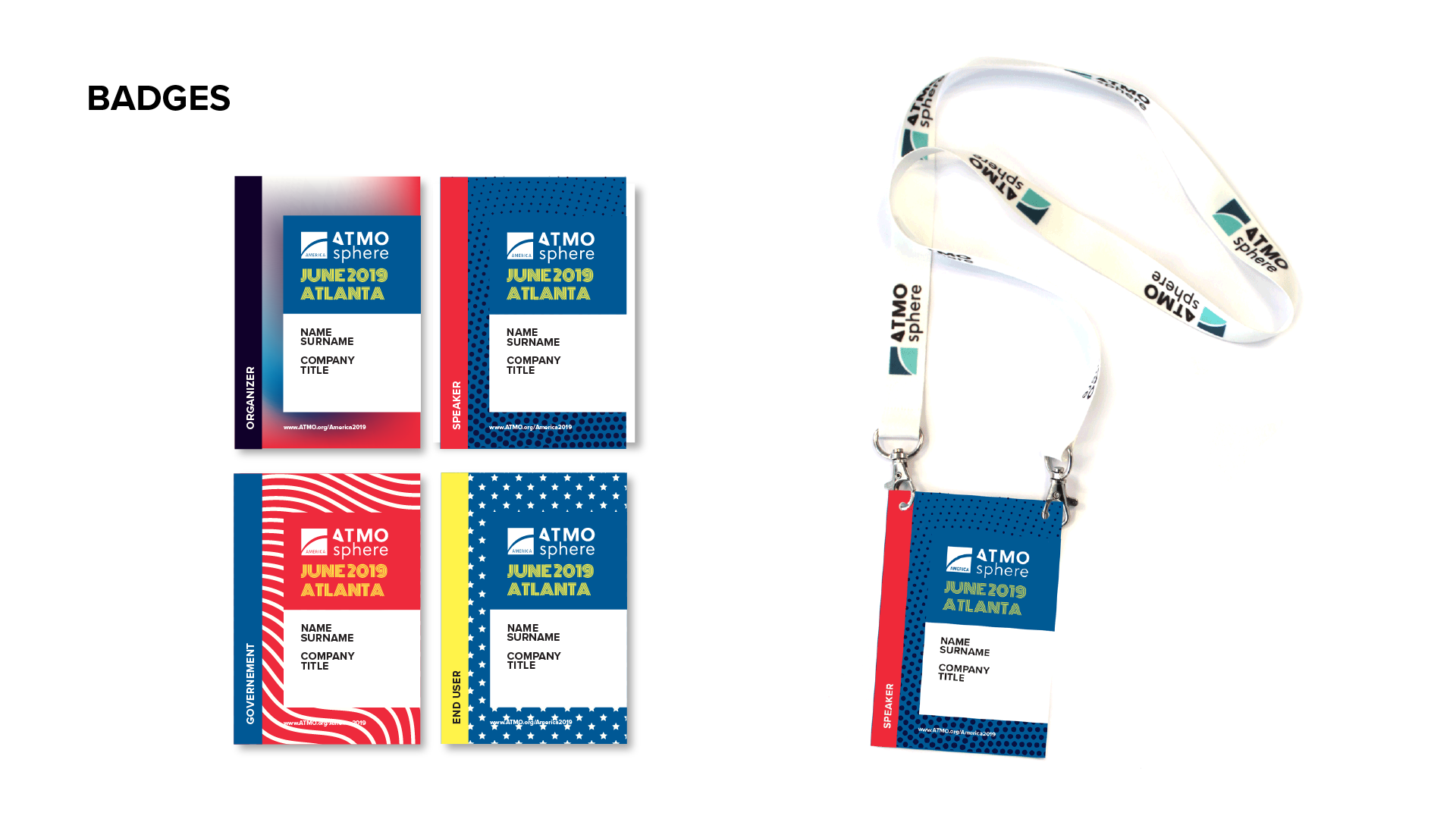
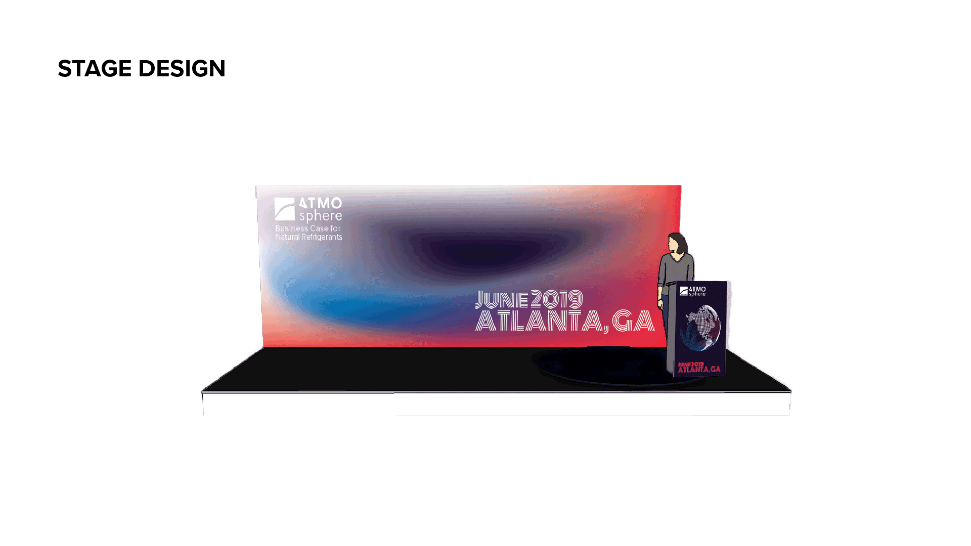
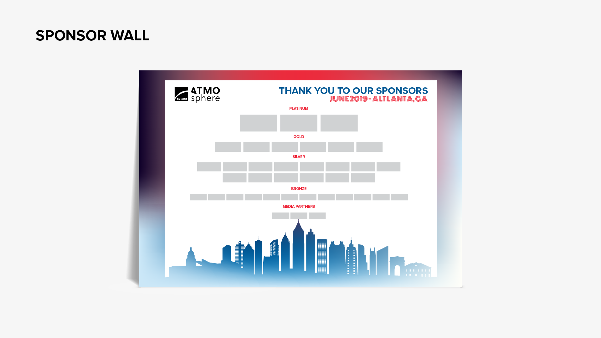
For the 10th anniversary of ATMOsphere Events, a new visual brand strategy was developed from scratch. The visual concept draws inspiration from temperature maps of Earth and the atmosphere — a reminder of climate change and rising temperatures. Each event received its own color scheme based on location photography, complemented by patterns reflecting regional context.
Role & Responsibilities
Full brand strategy for the anniversary event series, including visual concept development, color scheme creation, pattern design, and location-based design adaptation across all global events.

Process
Ten years in, the brand needed to grow up without losing its warmth.
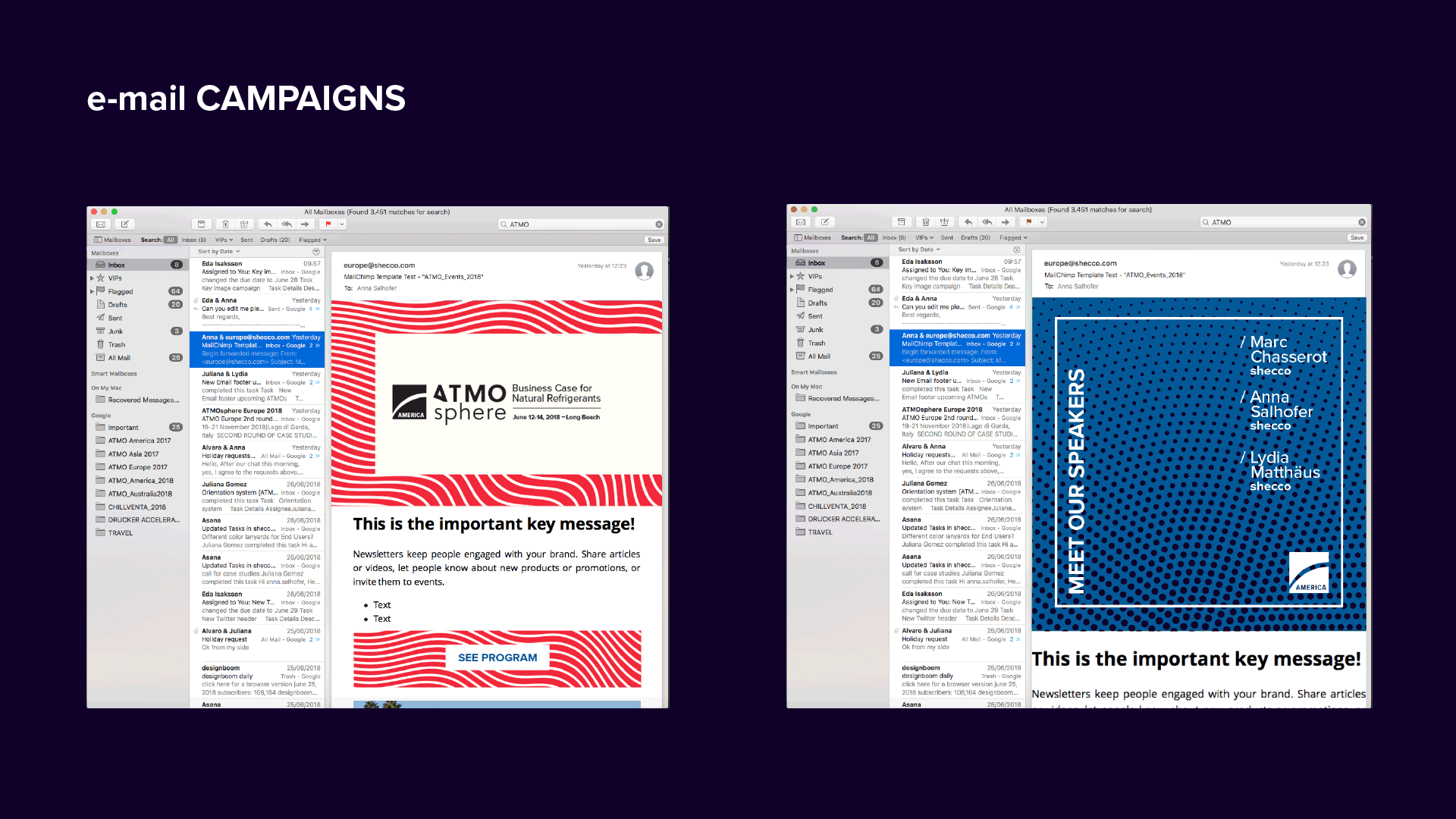
Developed the overarching brand concept — temperature maps as visual metaphor — and built a modular system that could be adapted city by city. Each location's color palette was drawn from environmental photography specific to that place, creating authentic local resonance within a unified global framework.